It’s a rainbow-inspired trend taking over shelves, tables and homes!
Designer Lauren Oviatt with Oviatt-Pratt and Associates shares tips for nailing the “color spectrum” look.
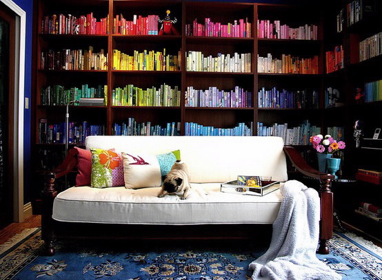
An emerging trend in home décor and among blogger-slash-decorators, crafters and d-i-y’ers worldwide is the trend of the ‘color spectrum’. From bookshelves to pantries, pillows, parties and just about everything in between, creative people everywhere are posting their ideas on how they’ve put their spin on this trendy look.
I have a theory as to where this all started – our crayons! Our closets! Our craft rooms! For me, it was my eye shadow collection when I was in high school. There is something so appealing to our organizational side to have things color coordinated, right? Raise your hand if your sweaters are color coordinated. Additionally, emotionally speaking – color coordination evokes a certain cheer, vibrance, youthfulness and fresh appeal that instantly energizes.
Here are a few tips to help you nail the ‘color spectrum’ look:
Don’t take color so literally.
The best designed rooms are a collaboration of color. You don’t always have to be looking for that specific color of fire engine red. A designer trick is that our eyes will pick up various shades of the same color without creating visual dissonance. The interest comes in varying shades of the same basic color. En masse it’s even more appealing.
The term “color spectrum” doesn’t have to mean “rainbow.”
It’s okay to gather pieces in different shades of different colors – you don’t have to stick with the primary and secondary colors of Roy G Biv. Choosing your favorite variations of the colors on the color wheel will keep your display sophisticated, personalized and well – intentioned.
Keep like colors together.
Employing my tip of collecting in a range of hues, when you’re placing objects, the best look is to group items by color. ALL Reds with all oranges and all pinks; none of this ‘one red next to one blue next to one orange’ business. After all – it’s the spectrum that we’re going for.
Pick one space to have fun with – and leave the rest alone.
Yes, you love color, and yes, you have a talent in grouping them… but, this look has the most high impact when done right, once. Choose a bookshelf to colorize, or your craft closet, or your shoe collection… don’t start throwing rainbows all over your house.
Keep backgrounds solid or neutral.
Your color spectrum display will have more of that wow-factor if you tone down what’s around it. I’m not saying you need a white bookcase to fill, but choose a neutral or a solid color as your complement. It can even be a take away from a piece you’re displaying.
Lauren has always had a love for interior and landscape design, floral décor, and all things beautiful! Having lived in the South and also on the west coast before settling in Utah, her design instinct is to combine traditional elements and furniture with updated style and current color palettes. She is constantly looking for ways to infuse glamour into her projects while bringing a fresh perspective and an eye for tasteful, classic design. Lauren has degrees in both Public Relations and Interior Design and worked in wedding/event planning before transitioning to residential and hospitality design.
Oviatt – Pratt is a full-service design firm in business for over 25 years, specializing in high-end residential and commercial design. The scope of their projects ranges from simple home renovations to large-scale construction projects where design is implemented from the first color choices to the final finishing touches. With direct access to over 75 upholstery, accessory and furniture lines, Oviatt-Pratt’s designers are able to provide each client with pieces that are particular to his or her taste and style. Their showroom is open to the public Monday through Friday.
Lauren Stimpson Oviatt
Oviatt-Pratt & Associates
Interiors & Design
801.451.4531


Add comment