
In 2025, we’re getting quietly colorful in our homes.
Is the new year calling for a home refresh? That update can be as simple as a fresh coat of paint. The paint trend for 2025 is “quietly colorful.” This comfortable approach to color might be just what we need to evoke feelings of calm in our space.
Amber Dunford walked through the ways we can use “quietly colorful” with tones and palettes that work, regardless of your design style.
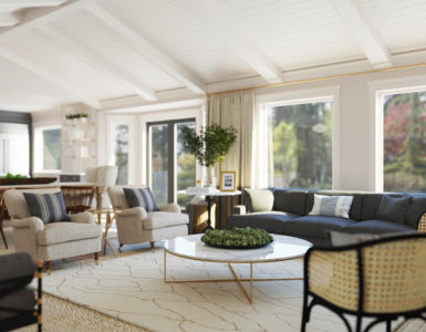
Color is one of the first things we assess when viewing an object or space – above shape, texture, or scale. Colors can make us feel calm and relaxed or energized and upbeat. Colors that are “quietly colorful” evoke feelings of calm because they are typically softer and appear more muted and chalky.
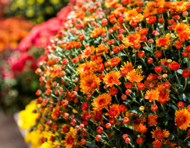
Quietly colorful rooms play in the same color range and saturation levels, with minimal contrast between each color being used. Soft blues paired back to earthy greens and blush tones are an example of this palette.
Colors Can Act Loudly and Quietly
Loud colors are highly saturated and read as much brighter in value. Think: fire engine red, Kelly green, or a sunny yellow. They demand attention an offer a high energy vibe to the space, as we are often more active and talkative around these colors. Quiet colors are typically more calming and shown in pastel shades with low saturation levels, creating a peaceful atmosphere. Our heartbeat will typically lower in speed in these spaces, followed by more relaxed breathing. This ultimately triggers the body to follow suit and begin to relax since we are not on alert or in a state of fight or flight.
Application
A quietly colorful space can be full of different soft colors to promote more interest, or a range of chalky saturation levels within a single hue to promote more relaxation.
For more interest: layer in soft prints like subtle ticking stripes, delicate florals, or a checkered pattern.
For more modernity: use colors in more of a color blocking style without a lot of print. Single color pillows, single color ottomans, graphic art.
For more relaxation: pick a color and play with the ranges within that single color to “color wash” the room in subtle transitions within a single hue.
Quietly Cool vs. Quietly Warm
Cooler colors like blues and greens will psychologically cool down a space that is physically warmer. These colors will also visually push away from us, making a space feel larger. Warmer colors like pinks and oranges will psychologically warm up a space that is physically colder. These colors will also visually advance towards us, making the space feel cozier and larger.
For more design advice, you can follow Amber on Instagram, @amberdunford_designpsychology, or visit her website, amberdunforddesigns.com.


Add comment